We are reader-supported. When you buy through links on our site, we may earn an affiliate commission.
If your home feels flat, too bright or overly generic, and you want a change, jewel tones can be a great option to boost the mood quickly. Rich colors help spaces feel layered and memorable rather than monotonous or unfinished.
Jewel colors, often called jewel tones, are rich and saturated shades inspired by gemstones like emerald green, sapphire blue, ruby red, amethyst purple, garnet red and topaz yellow. Jewel tones are bold and known for adding depth, warmth and elegance to a space, making rooms feel more dramatic, cozy and refined.
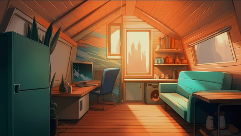
Jewel tones absorb and soften light rather than bouncing it harshly around a room. That creates a cocooning effect that many people want after years of cold gray interiors and bright white spaces. Deep colors visually pull walls inward, which can make large rooms feel more intimate and smaller rooms feel intentional rather than cramped.
These shades also feel elevated because they are naturally associated with precious materials, velvet textiles and historic interiors. That balance of luxury and comfort is exactly why deeper, more expressive interiors continue to gain traction. Houzz’s 2025 U.S. Fall Design Trends Report noted growing demand for bold color choices, personality and individuality, with homeowners moving beyond resale-safe neutrals toward more personal choices.
One of the biggest mistakes with jewel tones is forgetting contrast and texture. If every surface is dark and flat, the room can feel lifeless. To prevent this, use at least three layers:
If you’re unsure about a jewel tones color palette, you can try the 60-30-10 formula, which divides a room’s palette into three layers. 60% is for the main color, 30% for a secondary shade and 10% for an accent. Keep the jewel tone as the main color to maintain balance and make the space feel cohesive without becoming too bold or too muted.
A jewel tone can look elegant in one room and muddy in another. Natural light direction, bulb temperature and sheen all affect the final result. Also, it’s useful to consider texture.
Sheen affects how light moves through a room, with satin and semi-gloss finishes reflecting more light than flatter finishes. This can be useful when using darker colors in compact spaces.
Giving your home a new look can be easier than you imagine. Here are some ideas you can try:
A few intentional pieces can shift the entire atmosphere, but start with only one category. For example, choose emerald textiles in the bedroom or sapphire decor in the living room. Too many scattered colors can feel accidental.
Jewel tones perform best when paired with grounding materials. White oak, walnut, brushed brass, aged bronze, plaster finishes and creamy neutrals all soften intensity.
To achieve a modern look, pair jewel tones with clean lines and matte finishes. If you prefer traditional warmth, combine them with ornate lighting, vintage rugs and layered textiles.
If you want to create a jewel tones color palette, you can combine the tones with their complementary colors on the color wheel, like yellow and purple, for example.
Rich colors can look very different once they are on your walls, so testing first is always worth the effort. Paint large sample boards or use peel-and-stick swatches, then move them around the room throughout the day to see how natural and artificial light affects the shade.
Pay attention to nearby flooring, countertops and furniture as well. A jewel tone that looks perfect in isolation may shift once placed next to warm wood, cool stone or existing fabrics, so sampling helps you choose with confidence.
Different rooms call for different moods, so choosing the right jewel tone can make each space feel more functional and inviting. Use the ideas below to match color with purpose, whether you want a calming bedroom, a dramatic dining room or a stylish kitchen with lasting appeal.
Emerald green is one of the easiest jewel tones to use. Green evokes nature, so it pairs beautifully with wood, brass, cream and black accents. In a living room, it can anchor built-ins, a fireplace, a wall or a full room color drenching. Use warm lamps, linen curtains and textured rugs to keep the room welcoming.
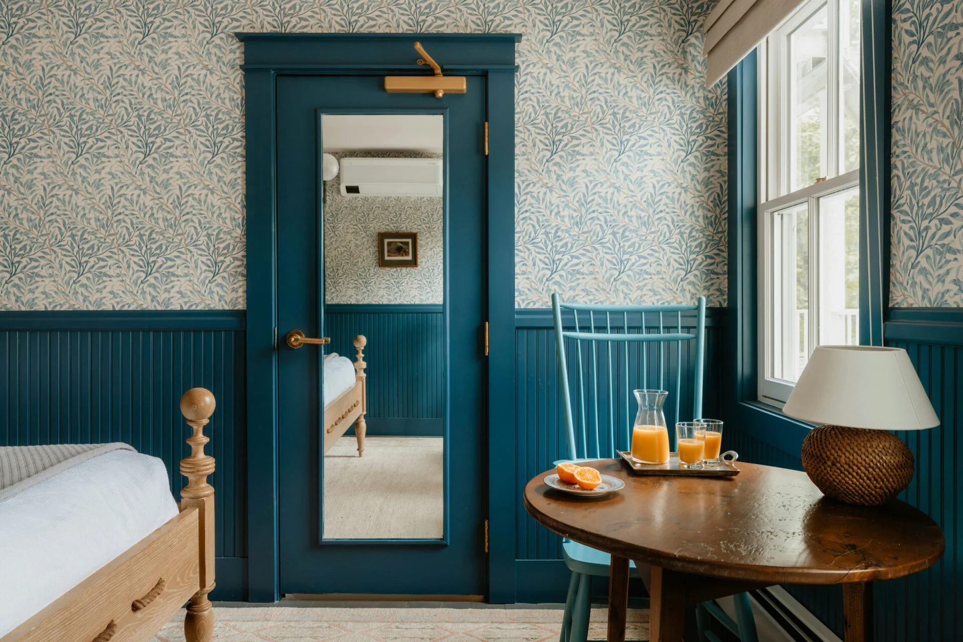
Dark blue bedrooms feel calm, grounded and upscale. Unlike brighter blues, sapphire or navy shades can make bedrooms feel quieter and more restful, especially at night under warm lighting. Pair blue walls with ivory bedding, walnut furniture and matte black hardware.
Dining rooms are ideal places to experiment because they are used for shorter periods and benefit from a more atmospheric setting. Ruby, wine and burgundy tones flatter candlelight and create a sense of occasion. Add a wood table, lamps, a brass chandelier or soft upholstery. Even one burgundy accent wall can make dinners feel more intentional.
Purple tones can feel intimidating, but muted amethyst or plum often reads as refined rather than loud. In offices, libraries and dens, these colors create focus and individuality. Balance them with natural leather, dark wood shelving and layered task lighting.
Teal bridges blue and green, making it versatile for kitchens. It works especially well on lower cabinets, islands or pantry doors. If all-white kitchens feel dated to you, teal offers a richer alternative. Use stone countertops and warm metallic fixtures to prevent the space from feeling cold.
Bathrooms are perfect for bold color because smaller spaces can handle deeper shades beautifully, as these tones make them look bigger and more intentional. Topaz yellow on walls or vanity cabinetry adds warmth and energy, especially when paired with brass fixtures, soft lighting or stone surfaces for a bright yet refined boutique-style feel.
When you combine saturated color with warm light, texture and thoughtful contrast, your home can feel luxurious and genuinely livable. Instead of playing it safe, you can create rooms that feel like somewhere people actually want to stay.