We are reader-supported. When you buy through links on our site, we may earn an affiliate commission.
Color brings life to just about anything you can think of, from design to fashion and so much more. While there are millions of shades to celebrate, the Pantone Color of the Year is certainly one to look out for each year. Check out the latest addition to the mix and what the last 10 years had looked like.
What Is the Pantone Color of the Year?
The Pantone Color of the Year is a chosen hue that the design community and color enthusiasts can create a conversation around. It was originally created in 1999 by the Pantone Color Institute to unite and draw attention to one color. The announcement is typically done the during December to set the tone for the coming year.
The selectors involve a global team from different backgrounds to create perspective. Color psychology and color trend research are utilized to narrow down the shade. They also look at how a color may influence global culture and what kind of message it conveys, which adds even more depth to the chosen Pantone.
The Pantone Color of the Year 2025
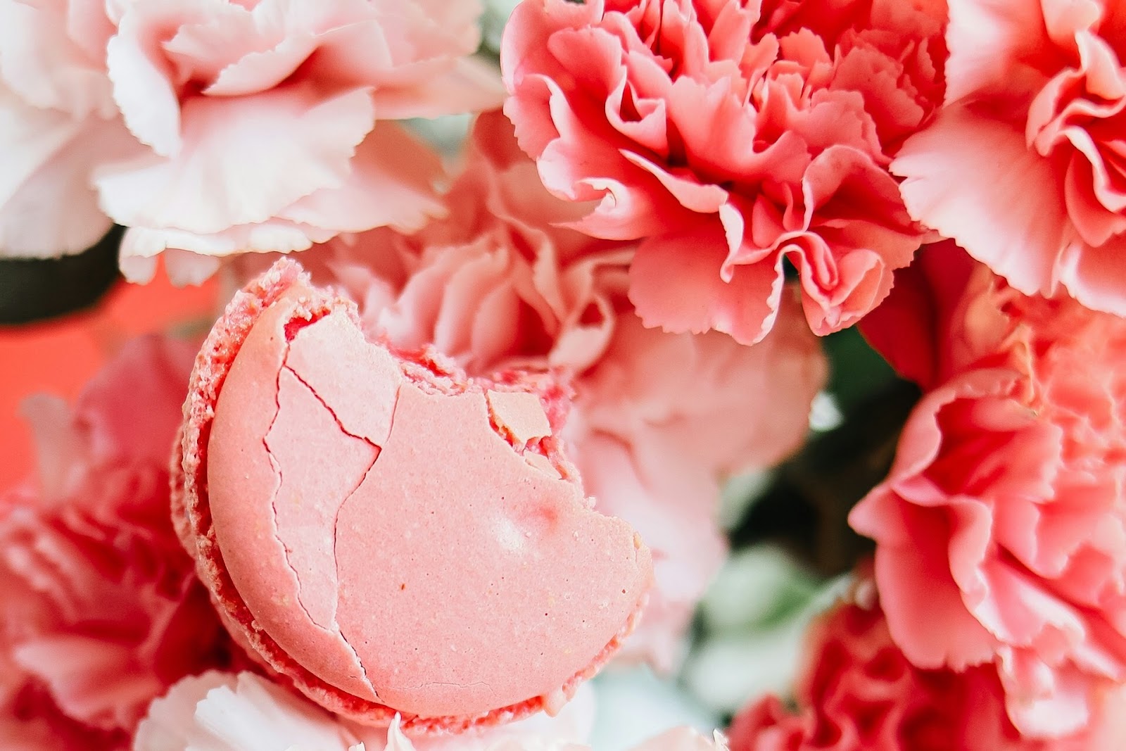
The Pantone Color of the Year for 2025 is Mocha Mousse. Categorized as Pantone 17-1230, the color is a beautiful brown hue that looks both rich and decadent. It plays on the idea of coffee, which is meant to represent the world’s desire for comfort and groundedness.
Mocha Mousse is certainly one of the more neutral shades to have come out in recent years, and it can be paired with anything. You can use millennial pink to bring warmth and femininity into its tan tones. Vanilla white is also a great accent to make the hazel color stand out a little more.
The 10 Pantone Colors of the Last Decade
There has been a vibrant lineup leading up to the reign of Mocha Mousse. Here are the numerous Pantone Color of the Year hues of the past 10 years.
1. 2015: Marsala
Pantone 18-1438 Marsala is a beautiful shade of earthy red that mimics wine. It’s pretty close yet distinct to Mocha Mousse, which could be a coincidence as they are Pantone Color of the Year 10 years apart. It’s certainly flattering to almost all skin tones, which made it popular for design and self-expression.
2. 2016: Rose Quartz and Serenity
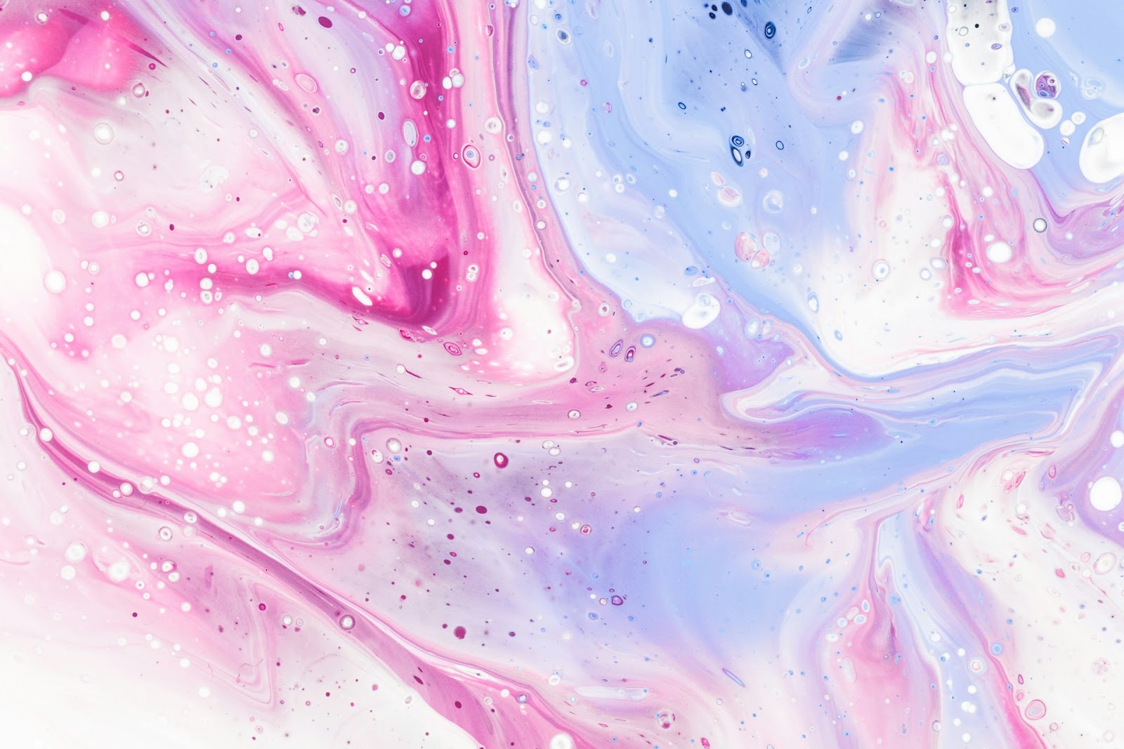
Pastels still reign supreme, but it held much more of a moment a few years back. Pantone 13-1520 Rose Quartz and Pantone 15-3919 Serenity, characterized by a soft rose and cloud-like blue respectively, were chosen as Pantone Colors of the Year in 2016. When shown in a gradient, the in-between hue was simply magical.
3. 2017: Greenery
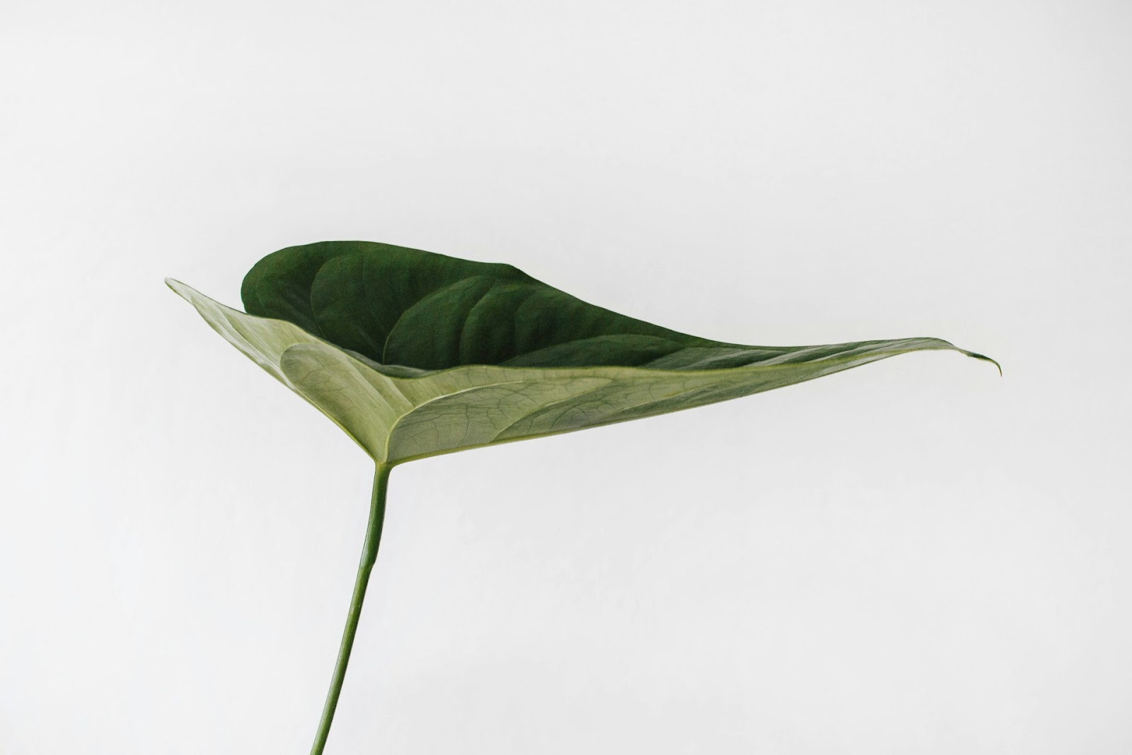
Green is always a beautiful and invigorating color. In 2017, Pantone 15-0343 Greenery was highlighted as the Color of the Year. Many believe it was chosen as concern grew for the environment as many started recognizing climate change. The hue inspires urban planning and puts the natural elements of the world first.
4. 2018: Ultra Violet
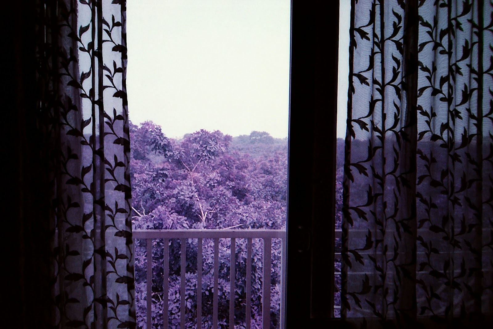
The previous year was quite vivid and 2018 followed in its footsteps with PANTONE 18-3838 Ultra Violet. The hue is a blue-based purple that imagines the galaxy beyond the world. Violet has also been a deep representative of power, emboldening society to hone its individualism and creativity.
5. 2019: Living Coral
The 2019 Pantone Color of the Year directed the world to look into the ocean. Pantone 16-1546 Living Coral is a vibrant pink that mimics the appearance of coral reefs, the ocean’s ecosystem. It creates a deep appreciation for the dynamic and optimistic displays deep within the world, almost telling people to look within themselves.
6. 2020: Classic Blue
Pantone 19-4052 Classic Blue was announced as the Color of the Year 2020, right before the pandemic had ensued. The original meaning behind blue was to give way to calmness and restfulness, mimicking the color of the sky to represent the world’s freedom. There is as much confidence in the hue as there is depth.
7. 2021: Ultimate Gray and Illuminating
PANTONE 17-5104 Ultimate Gray could be representative of the turmoil of the pandemic the previous year. It was a heavy time for children and young people due to missing school and having a lack of connection with others. The second half of the chosen colors, PANTONE 13-0647 Illuminating, indicates the light at the end of the tunnel— hope and positivity.

8. 2022: Very Peri
Everyone must exercise creativity and curiosity. PANTONE 17-3938 Very Peri was at center stage back in 2022 because it invoked intrigue and wonder. After the pandemic, it felt like a time of rediscovery in the physical world. There was also so much more buzz in the digital space, which Very Peri can encompass.
9. 2023: Viva Magenta
PANTONE 18-1750 Viva Magenta is another red-toned Pantone Color of the Year. The color is present in florals, jewels, food and so much more. Yet, there is an unconventional sense of wonder about what the color holds. It is often interpreted as representing life, joy, rebellion, domination and power.
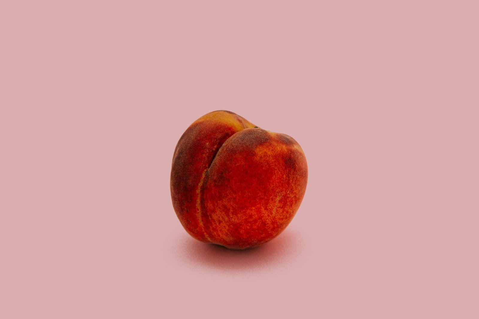
10. 2024: Peach Fuzz
Following up on such a strong color, Pantone 13-1023 Peach Fuzz was chosen as the Pantone Color of the Year 2024. The velvet and peachy hue encompasses youth, compassion, and kindness. It almost compels people to be more aligned with their inner spirit, and the spirits of those around them.
How to Use the Pantone Color of the Year
The Pantone Color of the Year is for everybody, from designers to manufacturers to color enthusiasts. There are a variety of ways to use Mocha Mousse in 2025. Here are a few suggestions:
- Clothing: Put together a closet that leans more toward neutrals. Mocha-colored shirts and dresses are lovely and relatively gender-neutral. You can accessorize them with gold to keep the look warm.
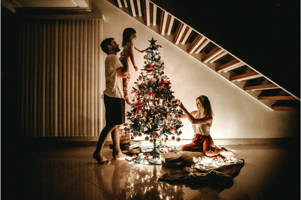
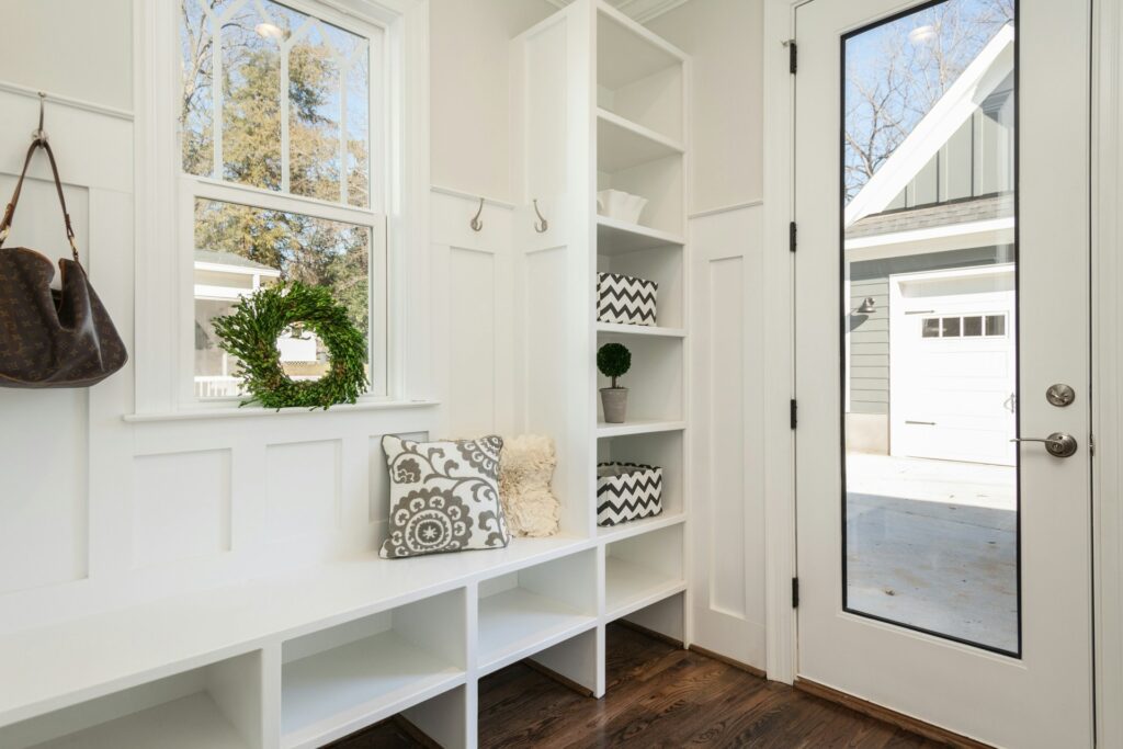
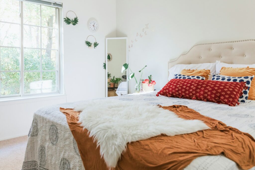
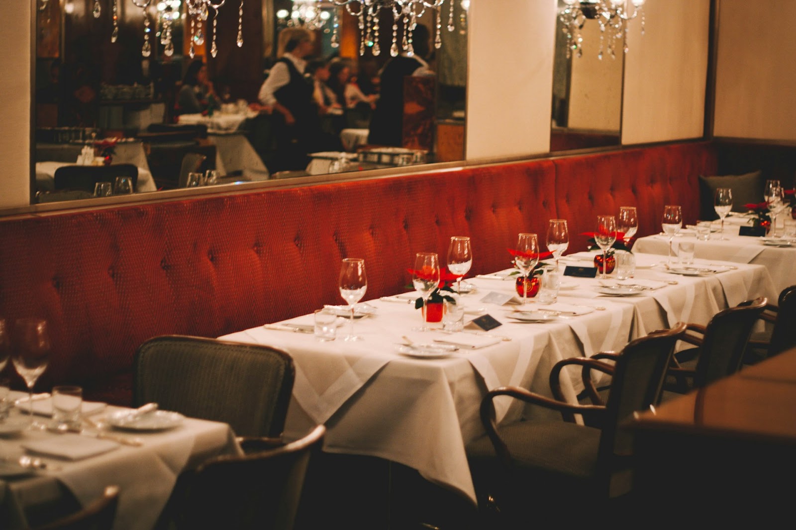
- Interior design: Mocha Mousse is a wonderful shade for the wall paint. You can seek out furniture with natural materials to stay within the color family. Gold accents are beautiful if you want to branch out, and it is quite complementary with blue and beige.
- Events: Holding a wedding? Organizing a work event? Take inspiration from Mocha Mousse and use shades of brown for the decoration. To keep up with the theme, serve coffee-based food and drinks.
- Personal planning: Every person needs a color palette for their vision board. Make the Pantone Color of the Year central to your selection. You can also seek visual inspiration from sites like Instagram and Pinterest.
Explore Other Pantones
The Pantone Color of the Year almost feels like a manifestation of the coming year and what the world should look to. Draw inspiration from the chosen hues and contemplate their deeper meanings, even on a personal level.
About The Author
Evelyn is the founder and editor-in-chief of Renovated with over 5 years of experience immersed in researching and writing on interior design, construction, and renovation. She is a passionate advocate for improving mental health and safety in the construction industry. When she's not writing, you can find her reading at coffee shops around PA.
Her insights have resonated far beyond Renovated, gracing publications like the National Association of Realtors, Construction Executive, Fieldwire, DecorMatters, and Renewable Energy Magazine.
For more sharp takes on design, construction, and everything in between, you can check out Evelyn's portfolio, https://evelynlong.com/.