
We are reader-supported. When you buy through links on our site, we may earn an affiliate commission.
Styling your home with matching colors is easy enough, but what about decorating with complementary colors that don’t match? Contrasting shades don’t get paired together often, but some of them make for surprisingly stunning combinations. Here are some complementary colors you can use to make your home stand out.
Complementary colors refer to shades that starkly contrast on the RGB color chart. They might be total opposites in terms of hue and color temperature, but they combine to create an unexpected match made in heaven. Learning how to decorate with complementary colors will open up dozens of new possibilities for you. Here are some popular complementary color combinations to get you started.
You might not have noticed, but we see blue and gold together all the time. Gold architecture looks magnificent under a clear blue sky. Blue’s cool natural hue offers a perfect contrast to gold’s warm artificial sheen. As you can see from the image above, you can utilize many different shades of blue and gold together with equal success.
Turquoise is a lively combination of green and blue, which makes for a great pairing with a subtle cream background. While cream keeps the room fairly neutral, turquoise gives it just the right amount of contrast. The shade is easy on the eyes and is a great choice for smaller pieces of furniture like pillows and ottomans.

Blue makes another appearance, this time with the light-tan color beige. Beige is a common furniture color, often used with tables, chairs and cabinets. It doesn’t stand out much, but it suddenly appears more lively next to a deep shade of blue. You can really spruce up your kitchen and dining area by adding some blue to the scene.
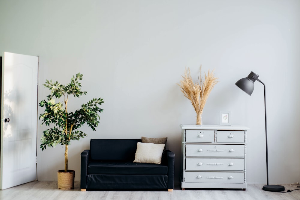
Black and white is the oldest complementary color combination in the book. The two polar opposites of the RGB spectrum look natural together, despite their differences. Black furniture demands attention in a predominantly white setting, and vice versa. This pairing is a great option for people looking to create minimalist living spaces.
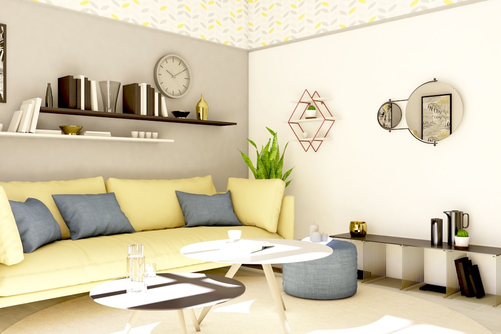
Yellow is an uncommon indoor decoration color because it’s so bright, but it cools off when paired with gray. The complementary colors evoke a warm, pleasant springtime feeling that fills the room. The yellow naturally attracts more attention on sunny days, while the gray becomes more noticeable on cloudy days.
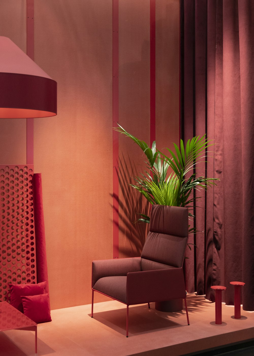
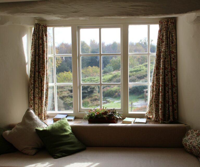
We see this festive combination often around Christmas time, but there’s no good reason to limit its use to one season. Red and green look great together 365 days of the year. Pairing some indoor plants with red furniture creates the perfect contrast. Just make sure you don’t choose extremely bright neon shades. Keep them cool to avoid overpowering the room.
Black and orange is another holiday-themed color combination associated with Halloween. Just as the gray/yellow combo has a springtime effect, black and orange create an unmistakable autumn vibe. Black symbolizes the longer nights ahead, while orange reminds us of pumpkins and the changing leaves.
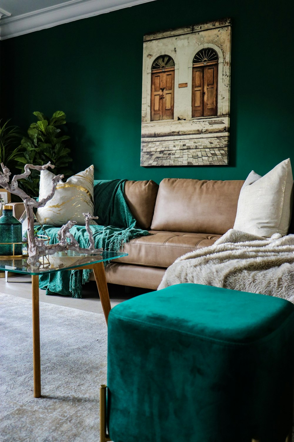
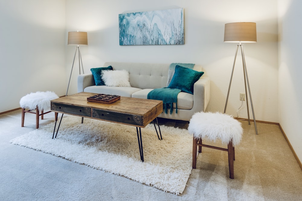
Teal is slightly darker than the aforementioned turquoise, bringing it closer to blue than green. This shade pairs perfectly with a rich coffee brown color, creating an earthy setting that outdoor enthusiasts will love. If you have any brown leather furniture, get some teal blankets and pillows to go along with it.
If your living space could use some more personality, why not decorate with complementary colors? You can’t go wrong with these combinations. Evaluate your furniture, wallpaper and other features and see which color would make the best addition.