")
We are reader-supported. When you buy through links on our site, we may earn an affiliate commission.
As the days shorten and the air turns crisp, your home naturally calls for a seasonal refresh. You don’t need a complete makeover, as just the right fall color palette can bring warmth and comfort indoors. Whether you’re cozying up a living room, adding depth to a bedroom or infusing warmth into a kitchen or bath, a few well-chosen hues make all the difference.
This guide will show you how to use fall-inspired colors thoughtfully and create inviting spaces that feel timeless, not trendy.
What Colors Are in the Fall Palette?
Fall palettes are rooted in nature’s cycles. Think leaves changing colour, deepening skies and woodlands and harvest fields. According to designers and trend forecasters, this season you’ll see a stronger emphasis on muted earth tones as well as richer, more nuanced colours.
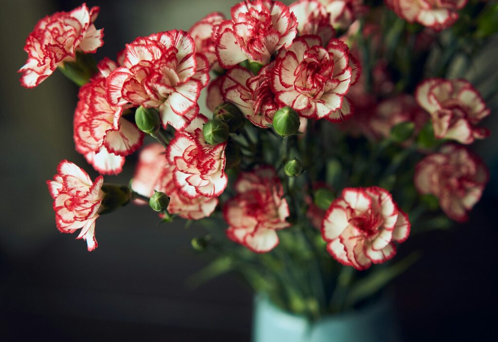
Some trends you’ll spot include deep, comforting hues like terracotta and brick red that signal familiarity and warmth, and the Pantone Color of the Year, which is a vibrant Mocha Mousse, is a perfect match. Green and blue tones that lean nature-inspired, like sage, eucalyptus and midnight teal, will bring calm and a connection to the outdoors.
Warm nature-inspired colours such as mustard gold, olive green and cinnamon-tinted browns put in a show. These evoke woods, harvest and rustic textures. Grounded reds and jewel tones, such as plum, leather brown or deep aubergine, will add depth to a room without feeling heavy. Your fall colour palette is no longer just “orange and brown”. It’s richer, cooler and more refined, but still cosy.
An Autumn Color Palette for Every Space
A popular way to choose your scheme for indoor spaces is to explore how nature interacts with color through photography. Simply load your favorite fall landscape into a Hex code generator and find the paint alternative to those shades. The results are spectacular.
1. Deep Autumn Color Palette
Be brave and deck your space with vibrant tones. Whether you choose delicious reds, toasty golds or warm browns, chromographic layering can really spice up your home. And if you’re not ready to paint a feature wall a deep orange poppy, you can always opt for neutral walls and use LED lights with tinted lenses to achieve a color drench without needing a drop of habanero pepper paint.
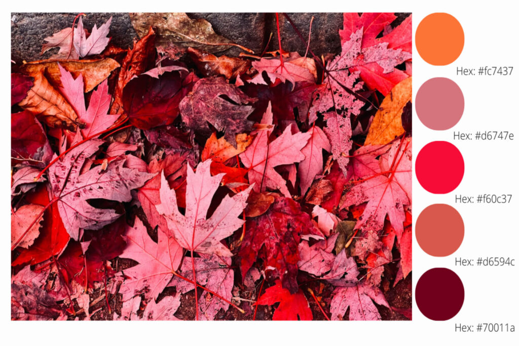
| Color choices | Hex codes and paint names |
| 5 Hex codes to love | #fc7437 // #d6747e // #f60c37 // #d6594c //#70011a |
| BEHR: | Dragon fire // juicy details // race car stripe // fiery red // red candle |
| Benjamin Moore: | Tangy orange // coral essence // bull’s eye red // habanero pepper// classic burgundy |
| Sherwin-Williams: | Invigorate // pink flamingo // fireworks // gladiola // crimson red |
| Farrow&Ball: | Bisque // fruit fool // Copenhagen roof // no match // rectory red |
| PPG: | Orange poppy // obsessed // wet coral // no match // ruby lips |
2. Warm Fall Color Palette
Draw on the subtle greens of the season with pale grape green, deep creek and plunge pool colors that whisper of spring’s sleep. Deck couches with woven drapes and invest in some babouche-colored accent pillows for the season when you start spending more time indoors at the fire’s glow.

| Color choices | Hex codes and paint names |
| 5 Hex codes to love | #deddb1 // #dbbc37 // #a67201 // #b5622e // #6a655a |
| BEHR: | Pale green grape // solarium // victorian gold // caramelized orange // patio stone |
| Benjamin Moore: | Pale sea mist // sun valley // corduroy // gold rush // deep creek |
| Sherwin-Williams: | Wild lime // eye catching // sconce gold // copper pot // limestone |
| Farrow&Ball: | Pale hound // babouche // wet sand // Charlotte’s locks // pantalon |
| PPG: | Misty moor // golden hour // cider toddy // mincemeat // plunge pool |
3. Cool Fall Color Palette
Embrace autumn as it leans into winter’s cold with sage walls, moss rock carpets and country redwood ornaments that glisten with gold trim and wooden accents. Include highland plaids and natural textures that connect you to nature in true biophilia, healing you from a long year while preparing you for the silvery snows to come. If pairing red and green, ensure you choose muted tones to avoid a glaring effect.
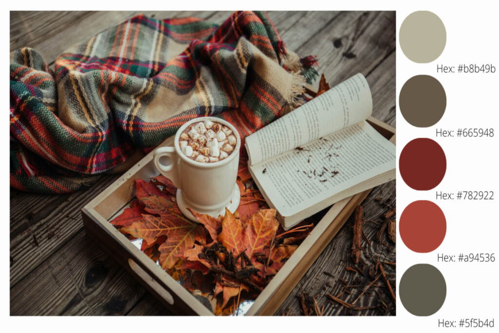
| Color choices | Hex codes and paint names |
| 5 Hex codes to love | #b8b49b // #665948 // #782922 // #a94536 // #5f5b4d |
| BEHR: | Court green // frontier shadow // red pepper // rodeo red // wild rice |
| Benjamin Moore: | Mosaic tile // north creek brown // country redwood // sangria // Aegean olive |
| Sherwin-Williams: | Sage // oak leaf brown // vermillion // Chinese red // garden gate |
| Farrow&Ball: | Ball green // cardamom // deep reddish brown // Harissa // no match |
| PPG: | Heavy hammock // coffee bean // brick dust // rum raisin // moss rock |
4. Autumn Color Palette
Chase summer’s last sun with the golds, rust tones and deep browns of an autumn forest. A bicycle yellow accent wall pairs neatly with an ivory or mist base palette. Deepen into river rock drapery and camel-toned upholstery for an earthy feel that promises an epic new year.
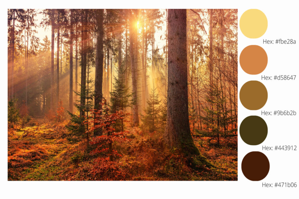
| Color choices | Hex codes and paint names |
| 5 Hex codes to love | #fbe28a // #d58647 // #9b6b2b // #443912 // #471b06 |
| BEHR: | Bicycle yellow // flaming torch // curry powder // Hampton // cimarron |
| Benjamin Moore: | Dalila // pumpkin spice // camel // river rock // cottage red |
| Sherwin-Williams: | Fun yellow // amber wave // sconce gold // marsh fern // polished mahogany |
| Farrow&Ball: | Sherbert lemon // wet sand // tack room door // cardamom // deep reddish brown |
| PPG: | Twinkle little star // gingerbread // chewy caramel // grapevine // bird house brown |
5. Jeweled Harvest Color Palette
Jewel tones are popular for various styles, whether you favor whimsygoth or moody palettes. Lean into darker base coats, such as wild plum, or opt for a more natural main color with a warm glow to give you more room when transitioning into the next season’s tones. This palette is as versatile as you.
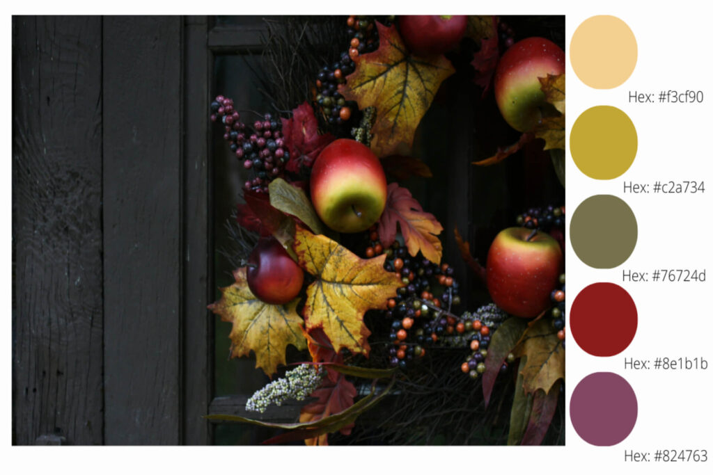
| Color choices | Hex codes and paint names |
| 5 Hex codes to love | #f3cf90 // #c2a734 // #76724d // #8e1b1b // #824763 |
| BEHR: | Warm glow // sweet & sour // truly olive // cherry tree // plum jam |
| Benjamin Moore: | Moir gold // spice market // shady lane // heritage red // bottle of Bourdeaux |
| Sherwin-Williams: | Sun salutation // hep green // relentless olive // classy red // juneberry |
| Farrow&Ball: | Yellow ground // corngold // bancha // incarnadine // preference red |
| PPG: | Maybe Maui // pollination // green briar // blaze // wild plumb |
How to Create Your Own Fall Palette
Creating your own palette means selecting a handful of colours that complement each other and then layering them throughout your space. With this approach, you build a palette that fits your space, style and the mood you’re after. Here’s how you can do that:
- Start with a base: Choose one neutral or gentle colour that will be the dominant colour in the room, whether for the wall colour, large furniture or floor.
- Add your key accent: Pick one or two stronger fall-colours you love, perhaps one deep hue and one warm accent. These will appear in smaller doses as cushions, rugs or trim.
- Finish with a pop: Opt for a dramatic or unexpected shade, such as a jewel tone or a cool variant, to add interest and surprise.
- Use texture and material: Fall palettes shine when paired with natural materials, such as wood, leather, woven fabrics and brass. They let your colours breathe and feel grounded.
- Balance warm and cool: If your accent colour is very warm, such as burnt orange or mustard, consider including a cooler tone, like sage or teal, to prevent the palette from feeling one-dimensional.
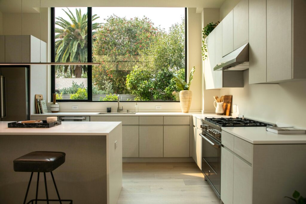
Using Your Fall Colors for Interior Spaces
Fall hues can easily and soothingly be applied to various home and office spaces. Use dark and dominant colors sparingly, or in rooms that are functional but have limited occupation during the day, such as bathrooms or kitchens. Dark or very bright tones are more tiring to look at when used in large quantities.
Living Spaces
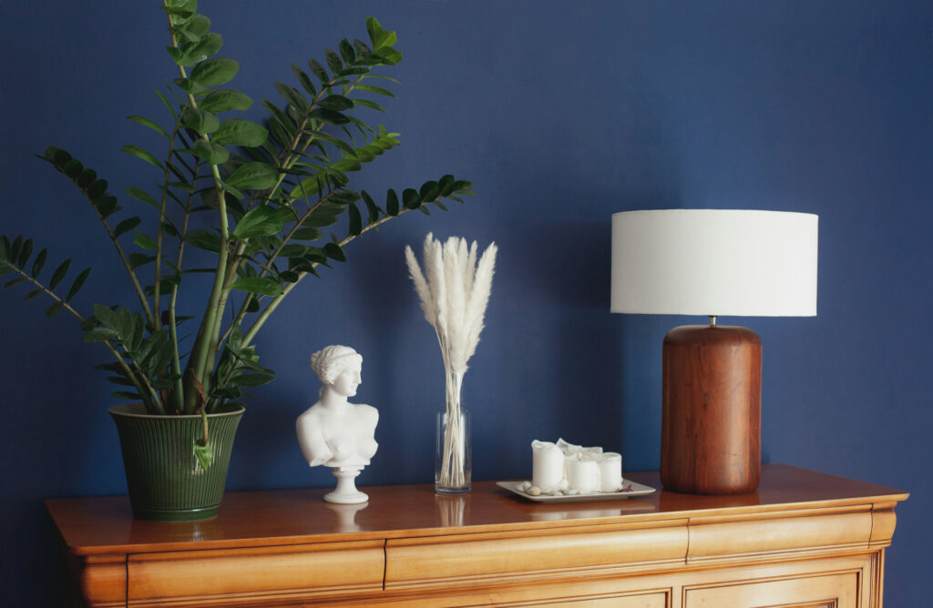
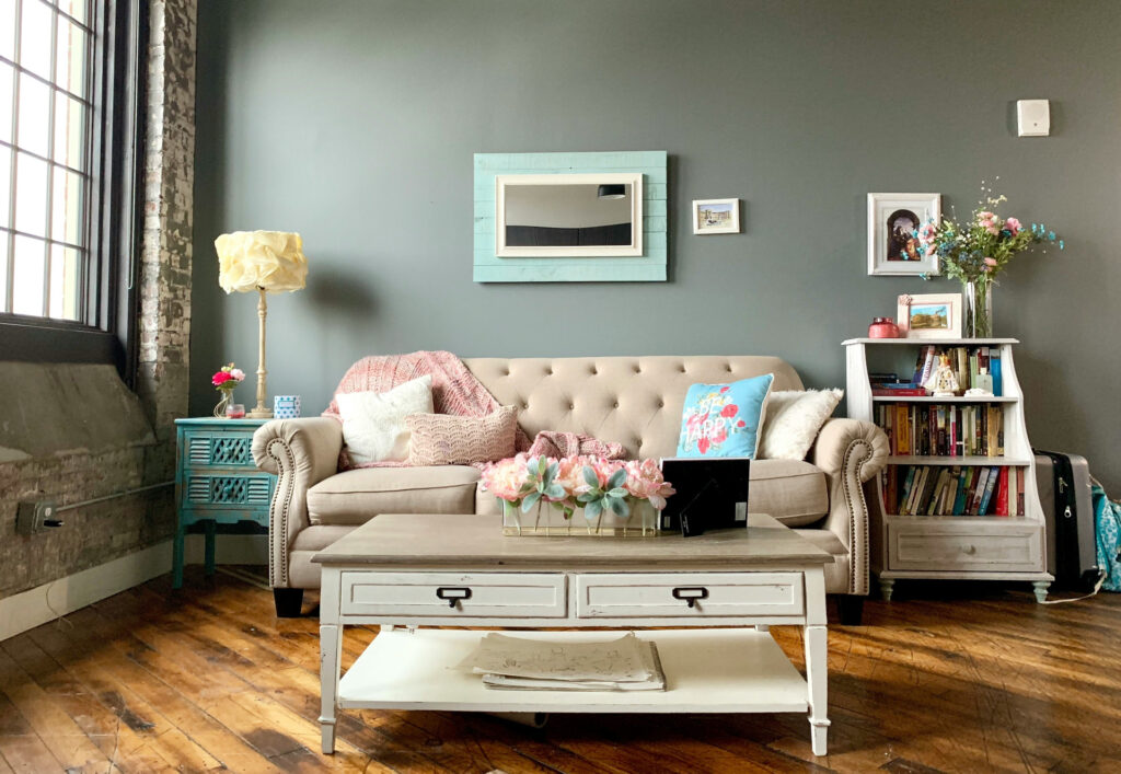
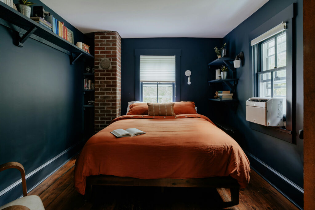
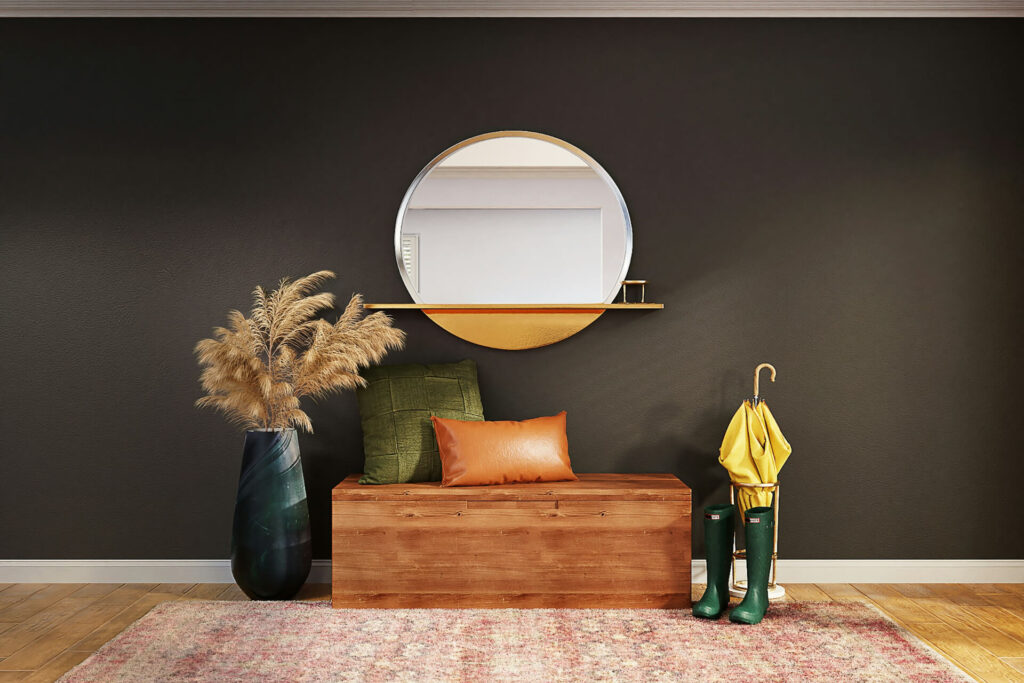
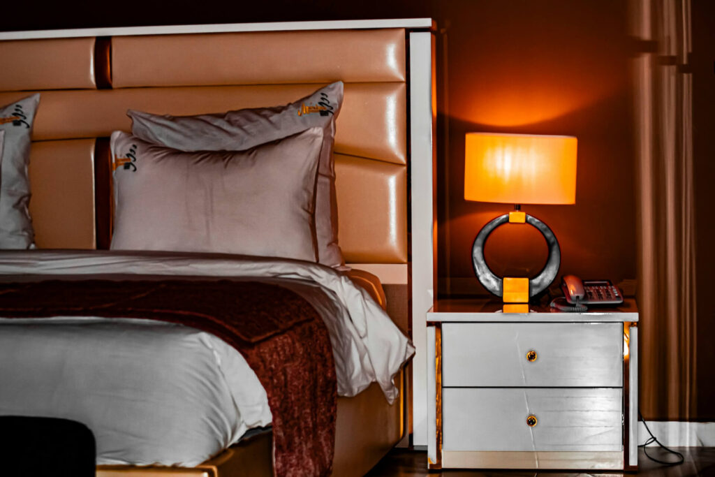
A living room or bedroom is a great place to go bold. If you’ve chosen a deep hue as part of your fall palette, such as a rich aubergine or leather-brown, consider using it on a feature wall or a large piece of furniture.
Anchor the room with softer neutrals on the remaining walls or large pieces, such as the sofa or bed. Then bring in your accent colours in cushions, throws, artwork or rugs. For example, a warm ochre throw, a sage side-table or a teal cushion will complete the look.
In the bedroom, you might use a cool autumn palette with sage or slate blue for the walls to foster calm, then layer in warm fall colors via bedding, curtains or decor items.
Functional Spaces
In kitchens or bathrooms, you often need practicality and durability, but you can still bring in fall palettes in meaningful ways. Consider painted cabinetry, butcher-block shelving or accent walls in warm terracotta or olive green. Pair with neutral backsplashes or tiles so the accent colour stands out without overwhelming.
In bathrooms, using a jewel tone, such as a deep teal or plum, for vanity or wall tile can create a luxurious feel. Then, you bring in the warmer autumn accents in towels, bath mats or accessories like copper or brass fixtures. Because these spaces are smaller, you can use the stronger colours more boldly.
Whether living spaces or functional rooms, the key is to let a milder dominant colour do the heavy lifting and your accent colours bring richness and seasonal warmth.
The Color Rule
Here’s a simple rule that keeps your palette balanced and inviting:
- Use one dominant colour for about 60% of the space on the walls, large furniture or floor.
- Use up to two key accent colours for about 30% of the color scheme in chairs, pillows, rugs and textiles.
- Use one pop colour for the remaining 10% with small accessories, artwork and a throw.
In practice, you might have warm taupe walls in the dominant hues, deep auburn chairs and olive-green cushions as key accents, and a brass lamp or plum-toned artwork for a color pop.
By following this rule, you avoid too many competing colours and ensure your fall palette feels cohesive, not chaotic.
FAQ
Can I Mix Warm and Cool Fall Color Palettes in One Room?
If you blend a warm accent, such as terracotta or ochre, with a cool one in sage or slate, you create visual interest. Just make sure your dominant colour remains consistent so the space still feels unified.
What If My Room Is Small? Should I Avoid Dark Colours?
Not necessarily. A dark hue can make a small room feel cozy if balanced with plenty of light-reflecting neutrals and metallic accents. Use it on one wall or a large piece rather than all walls.
How Do I Switch a Fall Palette Back When the Season Ends?
Keep your dominant colour neutral or timeless. Then rotate your accent and pop colours with seasons, such as autumn tones now and maybe pastel accents in spring. It’s an easy refresh without repainting.
Fall in Love With Seasonal Color
Autumn color palettes aren’t just about the season. It’s also about creating spaces that feel grounded, layered and lived in. By mixing warm and cool tones, balancing bold hues with soft neutrals and following a few simple color rules, you can design rooms that stay inviting well past fall’s end. The right palette will make your home feel as cozy as your favorite sweater, whether you lean into deep, moody shades or keep things light and golden.
About The Author
Olivia Elsher is a Senior Writer and Editorial Manager at Renovated. She has over 5+ years of experience writing about property related topics such as: real estate, home improvement, renovation, and construction.