
We are reader-supported. When you buy through links on our site, we may earn an affiliate commission.
Planning your next home refresh? The 2027 color of the year announcements are here, revealing some clear trends. From soothing blues to warm neutrals, top brands are leaning toward colors that create calming, nature-inspired spaces. Discover the picks that can help you design a home that feels both current and personal.
Each year, big paint and design authorities choose a Color of the Year based on what’s happening in our culture and the latest trends. Their picks reflect the mood of the moment and give everyone a hint about where interior style is headed next. As brands start to announce their choices for 2027, there’s a clear theme — tranquility, nature and comfort.
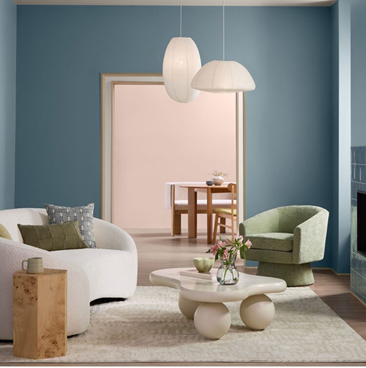
Image source: Valspar
Valspar’s 2027 Color of the Year, Cottage Door, is a welcoming, muted gray-hued blue with warm undertones. This grounding shade evokes authenticity and comfort, making it perfect for bedrooms, bathrooms and cabinetry. According to Valspar, it’s designed to create spaces that feel lived-in while promoting wellness and tranquility.

Image source: WGSN
WGSN and Coloro’s 2027 pick, Luminous Blue, takes a brighter approach. This electric shade leans into joy and optimism, designed to counteract the overwhelming pace of modern life. While still part of the blue family, it brings uplifting energy that aims to relieve stress while maintaining the year’s tranquil theme.

Image source: Dutch Boy
Dutch Boy has named Deep Rooted, a rich, earthy orange, as its 2027 Color of the Year. Inspired by the warmth of nature, this shade is meant to make spaces feel alive and inviting. The color leans into a feeling of grounded optimism, helping create a personal and effortlessly lived-in atmosphere.

Image source: Behr
For 2027, Behr has selected Grounded, a mossy olive green that brings the organic comfort of nature indoors. With its subtle brown undertones, the shade captures a quiet, restorative energy. The brand describes it as a color rooted in renewal, designed to make any space feel more balanced and calming.
As the design world awaits the complete lineup of 2027 Colors of the Year, some brands are releasing detailed trend predictions first. These forecasts offer an early look at the moods and palettes that will define the year ahead.

Image source: Sherwin-Williams
Sherwin-Williams takes a different approach by releasing an entire Colormix Trend Forecast rather than one color. Its 2027 palette features 48 handpicked hues for dramatic spaces, featuring 10 Continuity Colors. This gives you a broader toolkit for personal expression throughout your home.
The common thread across announcements includes grounding blues, nature-inspired hues and intentional design. These nuanced colors reflect a desire to bring the outside in. It signals a shift toward personal, layered spaces that pair beautifully with natural materials like wood, stone and soft textiles.
Try starting with small changes to help build up your confidence. You might paint a bookshelf, give some picture frames a fresh look or add a lamp in one of those trendy new colors.
The trick is to keep things balanced. These shades usually look best when they’re mixed in with your favorite neutrals. For example, you’ll find that these colors really pop against tan walls and enhance the room’s calm, relaxing feel.
The color trends for 2027 are all about bringing in calming, natural hues. You’ll see everything from Valspar’s cozy Cottage Door to WGSN’s cheerful Luminous Blue, so there’s really something for every kind of project. Whether you’re taking on a big renovation or just giving one room a little refresh, these colors can help you design a space that feels stylish and totally your own.