

We are reader-supported. When you buy through links on our site, we may earn an affiliate commission.
We are reader-supported. When you buy through links on our site, we may earn an affiliate commission.
Scalloped kitchen tiles are having a moment, and it’s easy to see why. With their softly curved edges and repeating pattern, they bring movement and character to a kitchen without relying on bold colors or complicated finishes. I wanted to introduce the trend into my own kitchen, but the goal was never to make the space feel overly decorative. Instead, I wanted a backsplash that felt warm, distinctive and timeless. Here’s how I achieved the look and what I learned along the way.
Many people agree that the kitchen is the most essential room in the house. It’s important to make this a space where you can comfortably cook and entertain. Kitchen design has been moving away from rigid lines and ultra-uniform finishes. In their place, homeowners are embracing softer shapes, tactile materials and details that make a space feel more personal.
Scalloped tiles fit nearly into that shift. Sometimes called fish-scale, fan, mermaid or shell tiles depending on their exact shape, they create a curved pattern that immediately adds visual interest. Unlike a highly patterned geometric tile, a scalloped design can still feel relatively subtle, particularly when the tile and grout are similar in color. That balance was exactly what I was looking for.
The first step was deciding what kind of scalloped tile I actually wanted. There are more options than I initially expected.
Some have a pronounced half-circle shape, while others are narrower and more elongated. Some overlap to create a fish-scale effect, while others are installed in a way that creates rows of arches or repeating fan shapes.
The difference can completely change the character of the backsplash. Pebble and subway tiles are a trend of the past, making kitchens feel outdated. I wanted something soft and organic rather than obviously whimsical, so I looked for a shape with relatively simple curves. If the kitchen is already full of visual details, a smaller or more understood scallop can prevent the backsplash from becoming overwhelming.
Once the shape was chosen, the next decision was color. A scalloped tile doesn’t necessarily need to be bright or dramatic. In fact, some of the most sophisticated versions use muted colors such as warm white, cream, sage, dusty blue, taupe or soft gray.
I found that choosing a color already present elsewhere in the kitchen helped the backsplash feel intentional. The tile could still have an interesting shape without looking like it had been added as an afterthought.
For a stronger statement, a saturated color can make scalloped tiles the star of the room. For a quieter look, a neutral tile allows the curved silhouette and texture to do the work.
Grout might seem like a minor detail, but it can completely change how scalloped tiles look. A contrasting grout emphasizes every individual curve, making the scalloped pattern much more prominent. This can be beautiful if the goal is to create a statement backsplash.
I wanted something more subtle, so I chose a grout color that worked closely with the tile. The result was still textured and interesting, but the overall effect felt softer.
There’s also a practical consideration. Kitchen backsplashes are exposed to splashes, grease, food and everyday mess, so the group needs to be suitable for the environment and properly maintained. The prettiest tile installation won’t look its best if the grout is difficult to clean or poorly suited to the space.
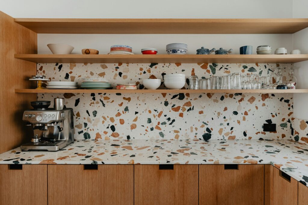
Backsplashes are a budget-friendly way to add character to your kitchen. But it’s important not to overdo it. Once I had a statement backsplash, I resisted the temptation to introduce patterns everywhere else. This was probably one of the most important design decisions.
Scalloped tiles already create repetition and movement, so they don’t need to compete with heavily patterned countertops, elaborate cabinet fronts or numerous decorative accessories. Simple cabinetry and restrained finishes allow the backsplash to stand out.
If the kitchen has wood cabinets, a softly colored scalloped tile can complement the natural warmth without fighting it. With white cabinetry, a colored tile can provide the contrast the room needs.
The objective shouldn’t be to make every element interesting. It should be to give each element a role.
A scalloped backsplash doesn’t have to cover an entire wall. In my case, I considered where all the tiles would have the greatest visual impact. The area behind the range is an obvious choice because it naturally acts as a focal point, but scalloped tiles can also work beautifully behind a sink or across a smaller section of countertop.
Using them selectively can actually make them feel more special. For a more cohesive appearance, extending the tile across the main backsplash can create a stronger sense of continuity. The right approach depends on the size, layout and existing features of the kitchen.
This is something I would recommend considering before installation. Depending on how the tiles are arranged, the duces can point upward, downward, overlap or form a repeating fan pattern. Each orientation produces a different visual effect.
The direction can also influence how the backsplash interacts with the cabinets above it. A row of upward-facing scallops can create an almost architectural border beneath upper cabinets, while a fish-scale arrangement produces more movement across the entire surface.
I looked at several installation patterns before committing because the tile itself is only part of the final design. How it’s laid is just as important.
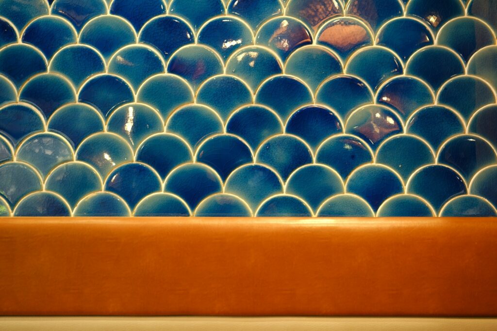
I also found that the finish of the tile mattered almost as much as its shape. Perfectly uniform, flossy tiles create a clean and contemporary appearance. Tiles with slight variations in color, texture or surface finish feel more artisanal.
For my kitchen, I preferred the latter. Subtle imperfections can give a backsplash that mass-produced, completely uniform tiles sometimes lack. When natural light hits an uneven ceramic or slightly textured surface, it creates small variations throughout the day.
Lighting can make a major difference to scalloped tile. Natural light highlights changes in texture and glaze, while under-cabinet lighting can emphasize the curves after dark. Glossy tiles tend to reflect more light, whereas matte or textured finishes create a softer appearance.
Before choosing the final tile, I thought about how the backsplash would look throughout the day rather than only under the showroom lighting. That helped me avoid choosing a finish that looked beautiful in one setting but felt completely different at home.
The easiest way to get scalloped tile kitchens wrong is to treat them as just another decorative element. They deserve some breathing room. Scalloped tiles introduce softness and movement into one of the hardest-working rooms in the home, and with the right color, grout, layout and surrounding finishes, they can feel far more timeless than trendy.