We are reader-supported. When you buy through links on our site, we may earn an affiliate commission.
Color-saturated rooms are everywhere right now, yet the best examples never look chaotic or loud. They feel intentional, curated and like someone who really understands their own style lives there. That’s the magic of color drenching, a design technique that wraps a room in a single color family to create a truly immersive environment. When done well, it brings softness, sophistication and clarity to a space that might otherwise feel very visually busy. If you want to incorporate bold colors while keeping your home livable and elegant, here’s how to do it right.
Start With a Color You Actually Love
Your emotional connection to a color matters more than any design rule. You’re not just painting walls, but building a mood you’ll live inside every day. Tune into shades that already make you feel something. Maybe you naturally gravitate toward earthy rust tones because they feel grounding, or deep teals because they remind you of calm water.
Take a look at your wardrobe, favorite art or photos saved on your phone. These clues help reveal your true preferences. The more authentically the color reflects you, the more harmonious your color-drenching results will feel.
Choose Your Saturation Wisely
Think of saturation as the volume level of your chosen color. Turning it up too high can feel intense, while keeping it too low might make the design feel timid. Finding the sweet spot is key.
Highly saturated hues like emerald or cobalt create striking impact and bring a sense of drama. Softer tones like sage, clay or stormy blue create warmth and comfort. The right choice depends on how you want the room to function. For example, a bedroom may benefit from gentler tones that soothe, while a dining room can handle richer saturation that feels vibrant and social. Matching saturation to the room’s purpose ensures the intensity of the color enhances the space, rather than dominating it.
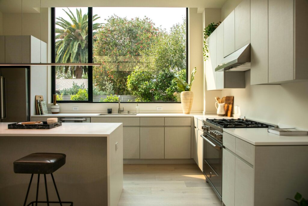
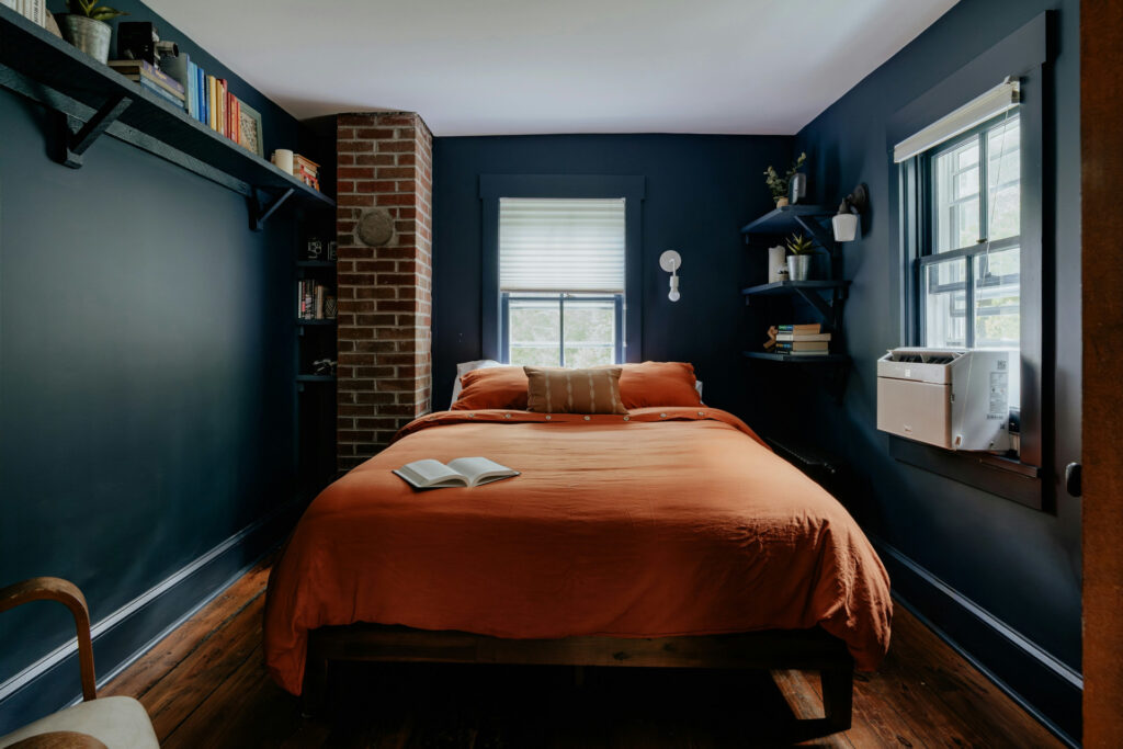
Extend the Color Beyond the Walls
Expanding the color across multiple surfaces is what separates true color drenching from simply painting a room one shade. Bringing the color onto the ceiling creates a cocooning effect. Matching your trim to your walls removes high-contrast lines and makes the room feel more uniform. Painting built-ins, interior doors and even shelves in the same palette elevates the aesthetic because everything reads as one cohesive environment. The consistency is what makes saturated rooms feel polished and intentional instead of patchy or unfinished.
Use Lighting to Your Advantage
Lighting determines whether your color feels moody, warm, energetic or serene. It can shift the entire vibe of a saturated space. Natural light tends to soften and blur intense tones, giving them a more natural appearance. Artificial light, especially warm bulbs, brings out richness and depth.
If your room lacks natural light, consider layering different types of lighting such as floor lamps, wall sconces, picture lights or pendant fixtures. Soft pools of light help break up the visual weight of darker shades. Good lighting can also bring out the texture in textiles, enhancing the immersive quality of color-drenched scenes.
Layer Textures to Add Depth
A single color can feel flat if everything in the room has the same finish. This is where texture becomes essential. Introduce a balance of smooth, rough, plush and glossy surfaces to give the eye something to explore.
A matte-painted wall paired with a high-gloss sideboard adds contrast without introducing new colors. Soft textures like boucle, chenille and wool add warmth. Natural materials, such as rattan and oak, add an earthy richness. Velvet or suede brings a sense of luxury. When these textures coexist within the same color family, the room feels multidimensional and inviting.
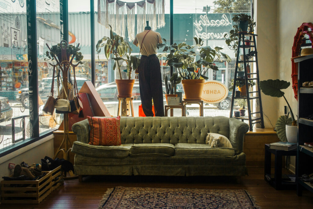
Break Things Up With Neutrals
Neutrals act like punctuation in a saturated room. They give the eye a moment to rest and help define key pieces without diluting the overall palette. For example, a cream sofa can feel luminous against deep plum walls. A reclaimed wood coffee table adds warmth and grounding to a bold blue room. Black accents give structure and modern clarity.
The key is restraint. Too many neutrals can pull attention away from the immersive effect of color drenching. Choose just a few pieces that complement the palette and provide the room with balance without interrupting the flow.
Add Small Contrasts for Visual Interest
While you want to maintain the overall palette, a few subtle contrasts can keep the room from feeling too uniform and bland. This could be a piece of artwork with lighter tones, a metallic side table or a patterned throw pillow that stays within the palette but introduces movement. Think of these as accents that highlight your primary color rather than compete with it. They bring personality and prevent the space from feeling overly controlled.
Test Before You Commit
Color behaves differently depending on the space, lighting and time of day. Painting large swatches on several walls helps you understand how the hue will actually behave. Live with these samples for several days to observe the shifts from morning to night.
If you’re drenching the ceiling or trim as well, test those areas too. Your color might appear cooler in darker corners or warmer in brighter spots. Taking the time to test helps you make confident decisions and prevents surprises once the whole room is complete.
The Art of Immersive Living
Color drenching is a way to shape mood, express personality and create a sense of flow in your home. When you approach it thoughtfully, every surface works together to form an atmosphere that feels rich, calm and inviting. Saturated spaces aren’t about being loud — they’re about being complete.

FAQs
What is color drenching?
Color drenching is a design technique where a single color or tonal family is applied across multiple surfaces. Walls, trim, ceilings, doors and even built-ins share the same hue, creating an immersive, cohesive environment.
What sheen should I use when color drenching?
Choosing a sheen depends on the mood and practicality you want. Many designers prefer a matte or eggshell finish on the walls because both soften saturated colors and help the room feel calm. Semi-gloss or satin is useful for trim and doors because it adds light reflection and subtle contrast without breaking the palette. Using varied sheens adds depth and prevents the space from feeling flat while keeping the entire scheme cohesive.
Do you paint outlets when color drenching?
Painting outlets is optional, but many designers do it to maintain continuity. White or off-white plates can interrupt a saturated wall, so painting them in the same hue helps the color remain uninterrupted. You can either buy paintable outlet covers or lightly coat existing ones. Just avoid painting the actual electrical components.
What are the best colors for a color-drenched room?
The best colors for color drenching are shades that feel rich, comforting and easy to live with. Deep greens, muted blues, warm terracottas, soft plums and smoky neutrals all work beautifully because they create atmosphere without overwhelming the eye. These tones adapt well to changes in lighting and feel sophisticated when applied to multiple surfaces. Choosing a color you naturally connect with is what makes the room feel intentional and welcoming.
About The Author
Rose is the managing editor of Renovated and a dedicated freelance writer with over six years of experience in the home and garden industry. Her passion for landscaping and sustainable practices is deeply rooted in her upbringing — growing up in a family of contractors, she was exposed to the world of construction and design from a young age. This hands-on experience fostered her love for nature and gardening, giving her a green thumb and a keen eye for creating beautiful outdoor spaces.
Throughout her career, Rose has honed her expertise in researching and writing about sustainable construction practices, focusing on innovative technologies that enhance the built environment while minimizing environmental impact. She is particularly interested in green roofing, water-efficient landscaping, and integrating native plants in design, all reflecting her commitment to sustainability. Rose's work has appeared in various publications, where she shares valuable insights and practical tips for seasoned professionals and novice DIY-ers.
In addition to her writing, Rose enjoys collaborating with landscape architects and contractors on projects that emphasize eco-friendly design and sustainable materials. She believes that every garden has the potential to be a vibrant ecosystem and works to inspire others to create spaces that are not only beautiful but also environmentally responsible.